4. Formatting graphs and curves#
4.1. Arranging graphs on a page#
Grace allows you to display several graphs on one page. The menu that manages this function is Edit/Arrange Graphs:
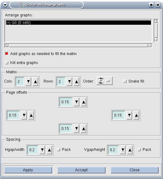
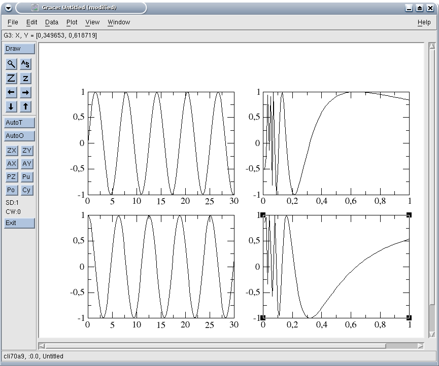
The choices above indicate drawing a matrix of (2x2) graphs (plus options concerning the order of numbering of the graphs and the different margins), which makes it possible to obtain a page of the form:
4.2. Formatting graphs#
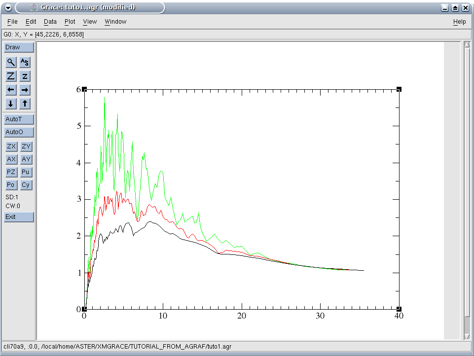
The Plot/Graph Appearance menu allows you to define the layout of the graphs, i.e. all the layouts common to all the curves of the graph, except the definition of the axes, which is accessible by Plot/Axis Properties.
We are content here with a summary description, for more advanced functions, the easiest way is probably to go directly through the tabs of the Plot/Graph Appearance dialog window.
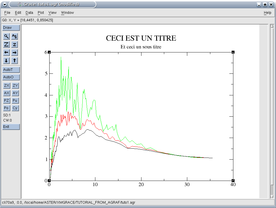
To put a title to a graph, the title text must be put in the Main tab, the size of the characters can be adjusted in the Title tab.
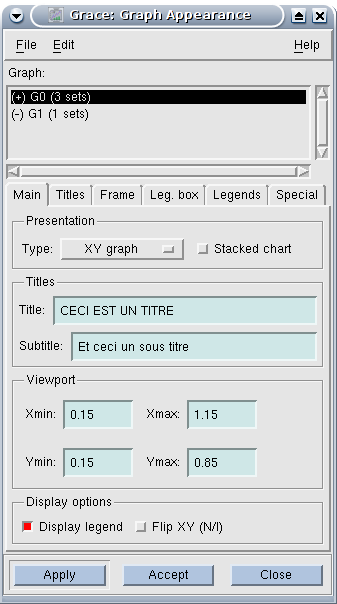
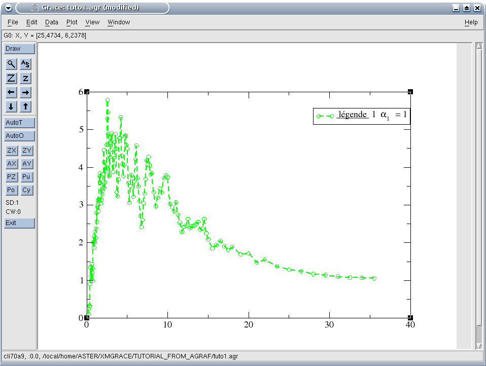
The decision to display a legend or not is given in the Main tab, the position of the legend box being defined in the Leg tab. Box, the size of the characters used is specified in the Legend tab. The legend text, defined curve by curve, will be seen later.
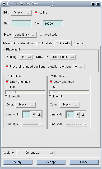
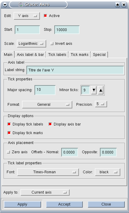
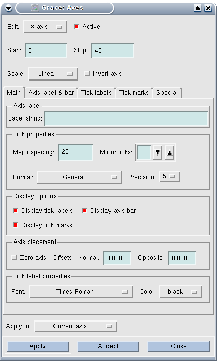
For the axes (so the Plot/Axis Properties menu), we also use the most common commands. First of all, you should note in the dialog box opened by Plot/Axis Properties the drop-down menu that allows you to define the axis you are currently modifying (X axis, Y axis,…). In this box you can choose the start and end values of the axis (by the Start and End fields), as well as the type of graduation (linear, algorithmic, etc.).
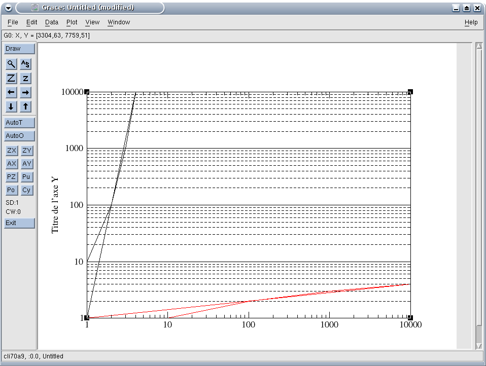
You can give a title (label) to the axes in the Main tab, the size of the characters and their orientation being defined in the “Axis label & bar” tab.
|
|
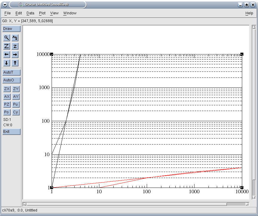
The large graduations (Major spacing, which are provided with an indication of value) and the small ones (minor ticks, which are only a line) are also defined in the Main tab; it should be noted that the definition of large graduations is done in the unit of the axes (for example put 10 for an axis ranging from 0 to 100 to number from 0 to 100 to number from 10) while the small ones are in a subdivision number between each large scale (for example put 10 for an axis ranging from 0 to 100 to number from 10 to 10) while the small ones are in a subdivision number between each large scale (for example put 10 for an axis ranging from 0 to 100 to number from 10 to 10) while the small ones are in a subdivision number between each large scale (for example put 10 for an axis ranging from 0 to 100 to number from 10 to 10) while the small ones are in for example put 9 to grade the previous subdivisions by 10 every 1 or 1 to graduate every 5): see illustrations following. How to enter the values corresponding to each large tick is defined in Tick labels, and how to plot the large and small ticks is specified in Tick marks.


4.3. Formatting curves#
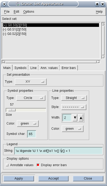
Curve formatting is controlled from the Plot/Set Appearance menu. In the dialog box opened by this menu, there is first of all a list of the curves contained in the current graph, which allows you to select the curve whose properties are being edited.
To attach a legend to a curve, you must define the text of the legend in the Main tab (Legend, String). It should be noted that it is possible to create complex legends.
You can choose the line style, its color and thickness as well as the symbols used to materialize each point on the Main tab (Line Properties and Symbol Properties). More precise definitions can be added to the Line and Symbols tabs respectively.
|
|